The Digital Aura Principle: Aligning Brand, UX and Software Performance
Why the most credible digital experiences connect brand promise, interface clarity, accessibility and engineering resilience.
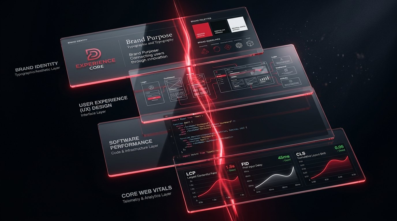
Customers experience a business as one system. They do not separate the brand strategy from the interface, the interface from the loading time, or the promise on the homepage from the reliability of the product behind it.
Organisations often build those elements separately. A brand team defines identity. A design team creates screens. A development team implements features. A marketing team brings people to the experience. Each discipline may produce competent work while the overall experience still feels fragmented.
The Digital Aura Principle is Aurae's way of describing the coherence customers perceive when brand, user experience and software performance reinforce one another.
A digital aura is a consequence, not a visual effect
The term does not refer to animation, gradients or decorative polish. It refers to the impression created by repeated interactions:
Brand perception is shaped by the answers. Visual identity creates recognition, but operational behaviour creates belief.
Five layers of the Digital Aura Principle
The brand communicates a distinctive and credible expectation. Language, visual identity and positioning help the right audience understand why the organisation matters.
Information architecture and interaction design make the next action understandable. The experience prioritises user goals over internal organisational structure.
Pages and product interactions load and respond without avoidable delay. Google’s Core Web Vitals describe important aspects of real-world loading, interactivity and visual stability; these measures are useful because performance is experienced, not merely benchmarked.
Accessible design supports keyboard use, readable contrast, meaningful structure, alternative text and clear form behaviour. Accessibility is not a separate visual mode. It is part of a usable product.
The system remains trustworthy when data is incomplete, a dependency is slow or an action fails. Clear error states, recovery paths and operational monitoring protect the experience beyond the ideal journey.
These layers are connected. A premium visual design cannot compensate for a confusing workflow. Fast code cannot rescue an unclear proposition. Strong branding cannot build trust if forms fail or customer data is handled carelessly.
What fragmentation looks like
Common symptoms include:
Fragmentation is expensive because it creates repeated decisions, inconsistent implementation and customer uncertainty.
Designing brand and software together
An integrated process begins before high-fidelity screens.
Restraint is a premium quality
Premium digital experiences are often associated with dramatic visuals. The deeper quality is restraint: knowing what to remove, where to slow the visual rhythm and when the interface should become almost invisible.
Restraint protects attention. It allows one strong message to lead, gives content room to breathe and ensures motion supports orientation rather than competing with the task. It also improves maintainability because the system relies on repeatable rules instead of one-off effects.
Measure the complete experience
Brand surveys, conversion data, usability findings, support themes and technical performance each reveal part of the picture. Useful measures include:
Metrics should explain behaviour rather than become isolated targets. A faster page is valuable when it improves the customer journey. A higher conversion rate must still represent the right customers taking an informed action.
Aurae × OS2 Studio
Aurae and OS2 Studio combine technology engineering with brand and creative experience. The partnership exists because software and perception should not be solved in separate rooms.
The shared approach connects strategy, identity, UX, content, development and operational quality. This does not mean every project requires every discipline. It means the disciplines that matter are aligned around the same customer promise and technical reality.
The bottom line
A digital experience becomes distinctive when what the brand says, what the user feels and what the software does are consistent.
That consistency is the Digital Aura Principle. It transforms design from decoration into behaviour, and engineering from infrastructure into part of the brand experience.
RECOMMENDED NEXT STEP
Create a Coherent Digital Experience
Create a Coherent Digital Experience — link to /contact or the relevant product enquiry form.
QUESTIONS & ANSWERS
Frequently Asked Questions
What is digital experience design?
Digital experience design coordinates content, interaction, visual identity, accessibility and technology across the complete customer journey.
Does website performance affect brand perception?
Yes. Delays, unstable layouts and unresponsive interactions influence whether an experience feels dependable. Performance is therefore part of perceived quality, not only a technical concern.
How do Aurae and OS2 Studio work together?
Aurae leads technology strategy and engineering while OS2 Studio contributes brand, creative and experience design strengths. The partnership aligns these capabilities around one product and customer outcome.
SOURCES & BACKGROUND
Authoritative References
These references support the technical concepts. The article should retain original Aurae analysis rather than reproduce source wording.
- ▪Google web.dev — Web Vitals
- ▪W3C — Web Content Accessibility Guidelines (WCAG) 2.2
- ▪OS2 Studio